QUARTO CREATIVE
Covering the Spread
Episode 3: Redesigns, Part 2
Louanne Welcome to “Covering the Spread, Magazine Design for the Next Age,” a monthly discussion of all things related to our favorite medium, magazines.
Scott Whether you’re a seasoned designer, an aspiring creative, an editor or publisher, or just someone who appreciates the art of storytelling through visuals, this is the place for you.
Louanne I’m your host, Louanne Welgoss from LTD Creative, a graphic design firm located in Frederick, Maryland, and I've been working on publications for thirty-two years. You can see our work at LTDCreative.com.
Scott And I’m Scott Oldham from Quarto Creative, who's been making magazines for twenty-five years. You can see my work at QuartoCreative.com. And on this podcast, we'll chat with industry experts, designers, editors, and production pros to uncover the secrets of all things magazine.
Louanne It's time to turn the page and what you thought you knew and reimagine the future of publishing.
Scott Welcome to part two of our discussion with designer Carol Moskot. In this episode, Carol will walk us through the redesign of Broadview Magazine.
Carol Broadview is an independent Canadian magazine, featuring award-winning coverage of spirituality, justice and ethical living. “Spirituality, Justice and Ethical Living” is the magazine’s tagline, and we try and touch on all three in every section of the magazine, every issue. Broadview challenges and inspires readers seeking to live a purpose-filled life. What does that mean? It’s a three-pronged mission: spirituality. There’s spirituality reporting that features Christians’ perspectives on belief and faith, but also with points of view about other religions. They cover social justice from a local and national global context. They also talk about ethical living stories, which offer inspiration and ideas on how we can all make a positive difference in our lives. It’s a wonderful, progressive magazine with progressive Christianity as its foundation. But what’s really interesting about Broadview is that it was founded in 1829, and it was, initially, known as the Christian Guardian. Why does this matter? Well, it’s interesting in that Broadview is the longest, continually-published magazine in North America, and the second oldest in the English-speaking world. And for 80 years, it was called the United Church Observer. So between 1829 and 2018, the magazine had been redesigned and rebranded four times.
Louanne Wow.
Carol Yeah. And I did the last one.
Scott You’re one of four.
Carol Yeah, I did the fourth of the four.
Louanne It’s very interesting that they’ve changed from the naming — just being very Christian-sounding, church-oriented to something that you wouldn’t think at all, just by the name, is faith based. Unless there’s something I don’t know.
Carol What’s interesting is that the redesign — the last redesign — was initiated by the central business problem the magazine had been dealing with for the past 50 years, which was audience-based. Due, in part, to secularism, secularization and an aging membership, the denomination of the United Church has been, essentially, closing one to two churches per week. The United Church audience — not the magazine’s audience, but the United Church parishioners — had been carrying the magazine as readers. For a long time. The projection showed that, if the magazine continued to rely on the good people of the United Church pews, the magazine would be shuttered as of 2024 — last year. This was out of research that we had done back in 2018. So the magazine would not exist today, had the redesign not happened.
Louanne That’s pretty amazing. How did you find each other?
Carol The person who is the editor in chief, as well as the publisher, is Jocelyn Bell, and she’s been with the magazine for a long time. Jocelyn and I had met when she became the editor of a magazine called Child View for World Vision Canada. You may be familiar with World Vision International. They are based in the US and they are also they have an outpost in Canada. I had been the art director of Child View — which is their in-house magazine, which is sent to all the sponsors — for about ten years, when Jocelyn became the editor of Child View. We forged a really great art director/editor relationship over that time and established a way of working together. After several years, she left Child View and she went to become the associate editor of the United Church Observer, which was the iteration of Broadview before the redesign. She was there for many, many years and then, eventually, became the editor-in-chief. When she did, she started to tackle this downward spiral of readership and how she was going to keep the magazine afloat. She put her publisher’s hat on, and she’s quite brilliant and did a major undertaking of a readership survey — a study of the magazine and the way forward.
Louanne How long did that take?
Carol The readership survey took almost a year. It was very intensive, and it was a survey of the readership and the business itself.
Scott What was the nature of the survey? Did they do a focus group or was it mailed — how did they distribute it?
Carol They did mail and they did phone. So they interviewed people. They had a lot of realizations from it. The things that were in the magazine’s favor were: a loyal subscribership who read the magazine from cover to cover. They send letters to the editor. They renew their subscriptions. The only issue at hand is that the readers loved the magazine the way it was, and they weren’t asking for a change. But there was this realization that, in order to continue publishing the magazine, we couldn’t just focus on the people who were United Church parishioners, receiving the magazine. We had to look outside the United Church membership, because it’s a membership magazine. We have to look outside the United Church membership for audience growth. We had to recalibrate the content of the magazine to bring in new readership, while maintaining the content that our current readers loved and valued. It was a very big task in order to do both at the same time. It’s a risky, risky thing to do with a publication that’s been around for nearly 200 years.
Carol I’ll tell you some of the interesting workarounds. The task was to come up with a brand new name, first of all, and move away from the name the United Church Observer, to something that was less evocative of church, especially if we were going to move to the newsstand. We also wanted to update the tagline, which was based on this tweaked mission: Faith, Justice, Ethical Living. Of course, there would have to be a new visual approach that would appeal to this broader audience and newsstand audience. And coincidentally, the office for this magazine was located on a street called Broadview. We tested the name, amongst others, and Broadview was the clear winner because it spoke in a very general way about what our what our next steps were. And then within Broadview, we created a separate and distinct section that targeted the original readership. The inside section was uniquely branded “The United Church in Focus,” and it was chosen to echo the longstanding magazine United Church Observer. So a magazine within a magazine. Familiar, yet distinct. This worked really well because we could satisfy both our new readership and our current readership.
Louanne It's interesting. And then you also incorporated justice and ethical living into that as a result.
Carol Exactly. So spirituality, justice and ethical living were and are a part of the way that we tackle the subjects in the magazine. We have a front of the book, back of the book, just like every magazine.
Louanne I love how it’s broken out into sections. I’m looking at your website. I’m looking at all this, realizing that you really don’t have to be Christian or a person of faith or anything to take an interest in any one of these subjects because they all look pretty interesting. Some of it is politically based, some of it’s just a deep dive into somebody who’s experienced something in their life. It’s good, good content for anybody who just wants to be a better person.
Carol Exactly. That’s the appeal of the magazine. There is something for everyone. People find that the different facets of the magazine don’t necessarily have to have a religious tone to them. Where that really comes to bear — more of the faith-based part of the magazine — is “The United Church in Focus” section, which also reports on what’s happening in the church. There are parishioners who still want to know what’s happening in the church. There have been some really interesting censuses in the US and in Canada about how people want progressive spirituality. They don’t necessarily feel the need to go to church for it, but that’s a whole other subject. But that’s something that really influences how the editorial content is shaped. It does shape how I choose visuals and how I design. Let’s talk about the redesign. Once we had the brand proposition in place — I delivered a brand proposition which everyone agreed on —then we literally met at Jocelyn’s, (the editor-in-chief/publisher) at her kitchen table: myself, our features editor, and Jocelyn. We sat down and we redesigned the content of the magazine. We had a whiteboard, and we were talking about what every section of the magazine needed — what every page needed. Reconcepting sections, deciding what to keep — what makes sense in terms of how many pages and how much weight every section should have, how to differentiate between every section. It was a very, very intensive three days. We worked through every single page and nuance of the magazines. We talked about drop caps, and we got out of the way all of those things that we weren’t sure about and how things should look and feel. And after those three days, I was able to go away and work on the redesign because I was equipped with what the content was, what wasn’t working, what was working, and how to move forward with it. This was taking place in Toronto. This is my hometown, and I was getting on a plane and going back to New York to work on the redesign. Long distance at this point.
Louanne I love the idea of a three day workshop. Instead of having a meeting and then, in three weeks, I’ll have another meeting and then in three weeks … It really makes you focus. It's just like a regular team-building type thing that you left, probably so energized and excited to go back. And you probably wanted to work on it on the plane after three solid days. I recommend that to my clients. Whoever’s got the best kitchen wins.
Carol Access to a good coffee shop really helped. That three-day redesign kickoff meeting was incredible. The findings of the survey came up over and over again, and it helped us build that readership profile. We defined our new target readership and audience characteristics. I want to talk a little bit about that exercise. The brand words that I came away with for Broadview: strong, solid, vocal, clear, powerful, fresh, dependable, positive, smart, high-quality, hopeful, actionable, community-minded, familiar and trustworthy. I went back to New York and I began working on the redesign. My idea was: I was going to start with the cover, and then I was going to work through every section, and every time I presented an area of the magazine’s new design to the editors, I would print it out. This is very old school. I would mount them on foam core and I would send them. I would make two sets: one set for me and one set for them. I would send the set to them and I’d say, “I want you to set it up just this way.” And I would show them exactly how. They’re my friends, as well as a client. So they were cool with being instructed. Then I would take them through the entire presentation, and I’d explain every single decision that I made.
Louanne You did this virtually.
Carol I did it virtually.
Louanne So you were ahead of the times before the times?
Carol The great thing was that these words became the measure of every single area of the magazine. The end result was a visual redesign that reflected the magazine’s purpose: to be ideas-driven and to get to the heart of a given subject with sophistication, intelligence, and inspired curiosity.
Disclaimer The views, thoughts, and opinions expressed in this podcast are those of the hosts and guests and do not necessarily reflect the official policy or position of any organization, employer, or company they may be affiliated with. Covering the spread is intended for informational and educational purposes only. While we explore topics such as design trends, industry practices, and future predictions, The content shared should not be interpreted as professional advice or a definitive guide. Listeners are encouraged to conduct their own research Before making decisions related to magazine design, publishing, or business strategy. We may reference or discuss third-party content, technologies, or companies. These mentions are for context and commentary purposes and do not imply endorsement or affiliation unless explicitly stated. Additionally, given the ever-evolving nature of media and technology, some discussions may become outdated. We strive for accuracy, but we make no representations or warranties about the completeness or reliability of any information shared. Thanks for tuning in and enjoy the spread.
Scott This is a point that I would like to just stop on for a moment. The keywords that you identified, Carol: Can you run through those again for us, please?
Carol Absolutely. So Broadview’s brand words — their brand proposition, not their mission statement, but their brand proposition: solid, strong, vocal and clear, powerful, fresh, dependable and positive, smart, high-quality, hopeful and actionable, and finally, community-minded, familiar and trustworthy.
Scott I think it’s an excellent list, for one thing. What I find interesting about it is: To people listening, that list, at least in part, could help define their own brands. A lot of those words — smart and strong — are common among publications. The point, I think, that this brings out is that there should only be one publication that all of those words can be used to describe, and that would be, in this case, Broadview. As a piece of advice, a shorthand question that I think people undertaking a redesign should keep asking themselves as they go through the process — and I think you have spoken to this, Carol, maybe without using it in so many words — is: What ground do you stand on? What ground does your publication stand on that no other publication does? And how does that express itself? How can that express itself in the voice of the magazine and in the design of it?
Carol I’ve worked for so many different types of magazines: city magazines, food magazines, decor magazines. You have to define your vertical. How are you vertical amongst your group? If you look at Broadview, it’s one of many church magazines out there. The church is big and there are many denominations to the church. In the magazine world, what's your denomination? What makes you unique from other magazines? It’s not just the content of the magazine. Broadview is an independent. It’s not really affiliated with the United Church, which doesn't have a say in the content of the magazine. Our magazine is a registered charity, which gives us the freedom to speak the way we want to speak, in the tone that that we think is appropriate for our readership. That independence helps us find our voice. I think you’re speaking much more to: How do the words that I’ve used to define Broadview obviously make it unique? That arrangement is unique to Broadview, and every magazine has their own unique arrangement of words, which makes it its own singular vertical. I think you said it much better than I did: that singularity and focus on it, over and over again, and coming back to that, which is why those words are the ultimate measure of everything. It’s the measure of the content. Even today, with every issue, those words are always in the back of my mind. Are we still solving the original problem of Broadview? Are we still providing our readership with what we originally promised, or are we veering off, and how do we steer back on? We are always looking to those guardrails, which are those words.
Scott How have you measured the success of the redesign of Broadview?
Carol That's a really good question. After the redesign, the magazine was relaunched. We sent out a reader survey to gauge reaction. It was really important that we found out how our readership felt, and we sent it out. We got 700 respondents, and the overwhelming majority said that they would renew their subscriptions. They said that the new magazine was better than expected, which is great. And among the toughest group — those who told us in our 2018 market research survey that they were unhappy about the proposed changes and were unlikely to resubscribe — we saw converts. More than half said the new magazine exceeded their expectations. That 20% of current subscribers we risk losing by making the change? So far, they’ve not materialized. Our subscriber numbers seem to be following normal rates of attrition, but loyal subscribers are still happy. Yet they are still aging.
Louanne You probably have the same problem that, I think, everybody does out there, and that’s appealing to a younger audience. How do you attract that younger audience? What is the circulation of Broadview?
Carol 35,000 readers of the print magazine.
Louanne There's a digital component as well. I saw that there were newsletters.
Carol We have a podcast, and we have an incredible social media team — obviously, a young, striving social media team — that has a great feel for our audience and audience development.
Louanne I’m going to circle back. At one point, they thought that this magazine would not survive after 2024. It is now 2025. What proof do they have that it’s going to survive into 2026?
Carol Well, I can only speak for the dozens of awards that we’ve received.
Scott Speak of them.
Carol Over the last six years, Broadview has garnered more awards than any other faith-based publication in Canada, and it happens to be one of the most decorated faith-based publications in North America. I have been the recipient of many Society of Publication Designer Awards. And the American Church press … So imagine: We compete with the Canadian Church Press, which is a large Canadian church publication association, but we compete in the States and handily win awards. In 2023, over a dozen of those awards came from the ACP. We won the Associated Church Press Award of Excellence for best in class and design for the entire issue this past year.
Louanne Congratulations. Is the editorial also garnering awards?
Carol Oh, absolutely. It’s phenomenally well-received. It may seem like a small thing, but it’s a huge thing: We rely these days a lot on donation, and with our donations come the most incredible letters from our donors who tell us how important we are in their lives, not to mention our subscribers. When your readership writes to you and they communicate with you, that’s a sign that your magazine is doing well.
Louanne Yeah. Especially when they tell you how much they love the design.
Carol That helps. Just kidding.
Louanne Yeah. I love hearing about everybody else’s work and how they do it. I think our audience would really appreciate hearing a spin on your work, because it is different than what Scott and I have done in the past — at least myself, where it’s been very much more trade- and association-based. You have had very different types of jobs and opportunities than I’ve had, and I think a lot of people don’t think that you can apply that to trade publications. But you can take everything and apply it the exact same way and get the same results.
Scott There’s a funny bias, at least amongst specialty publications, which is, I think, what primarily we all do. They’re all specialty publications, aren’t they? Those organizations feel, for some reason, that their readers are different — that this group has to be spoken to in a very, very particular way. They are more time-challenged than others, or they have less patience than others, or whatever it is. And the truth of the matter is that people read the same way. Everybody reads and consumes content the exact same way as everybody else does. Doctors, lawyers, Indian chiefs: They all read the same way. And the principles of good design apply to all those audiences equally. That's my mission statement. Carol, let's give you a chance to plug yourself.
Carol My company website is carolmoskot.com. In case you're curious about how that's spelled, it's M-o-s-k-o-t, my last name. I showcase a lot of my newsstand work, my custom publishing work for various corporate clients that I’ve worked with. Part of my studio is a social impact design studio. I work with a lot of nonprofits, and I partner with organizations to tell their stories. The idea is to channel my clients’ voices and their values, and take the complex information that they have to deliver as nonprofits and turn them into really compelling narratives. I have taken on clients and made a lot of the nonprofits the bulk of my clientele, because I think it’s really important to help tackle some of the toughest challenges we’re facing in our time. And I’m a champion of those magazines that tackle that. And it’s not just magazines. I also I work with humanitarian and philanthropic organizations, think tanks, universities, arts and cultural institutions and community enterprises. So it’s a broad a group of clientele. I’m very interested in helping them tell their stories.
Scott Does anybody have a good anecdote from a redesign? We can compete. We can see who can have the show closer.
Carol I was going to give you a couple of my mistakes to avoid.
Scott Oh, that’s a great idea. Okay.
Carol I have to say, one of the biggest mistakes to avoid is: Don’t go it alone. Feel free to lean into your editors and bring them into the process. It’s essential that you are not making decisions in a vacuum. I think it’s also really important to make time to design and to think through your storytelling, rather than feeling rushed to move through a redesign or just your designs for stories. I spend quite a bit of time, reading through every feature story — every story in the magazine — and having lengthy story meetings with our editors. I really want to get their take on how they briefed and discussed the story with their writer, and how this story should unfold in the pages of the magazine. Then I get down and I read that story and I circle back with ideas and concepts. Don’t go it alone. That’s my advice.
Louanne A parting shot for us on that topic of “Don't go it alone:” It’s not just bringing in the editors. It’s always good to have another designer — even if that designer is not a publication designer — just to help visualize some things … just to give you some ideas. Another perspective on things. A couple of years ago, I took on a major redesign and I knew there was no way, with three comps for a series of three magazines all falling under one umbrella, that I was going to be able to do this on my own. So it was unbelievably helpful to bring in a third party, to brainstorm everything and to give her all of the information. We ended up incorporating some of her ideas. It was a nice blend, in the end, of some of what she did and some of what I did, as it always ends up being. She also had a really unique perspective to bring — how she perceived what they were saying — and they loved everything, as a result. Because when you are one designer, you tend to do things a certain way. You could pick out one of my redesigns a mile away.
Scott My last piece of advice would be: Don’t design anything you wouldn’t be happy designing yourself. I learned this the hard way many times. One of the things I like to try to avoid when doing redesigns is repeating myself, not just because it’s bad design, but because it doesn’t suit the nature of the project. You have to kind of really put yourself in the mindset of — not just the readers of the publication, but — the editorial team that's producing it. You have to be something of a psychiatrist in order to empathize with them and experience what they’re experiencing, and to design something that fits with that group of people. Frequently, I will find I’m designing something that is not what I would do if it was me, being in that situation, because I’m trying to design for this other team that does not include me. A couple of times, I’ve had the fortune/misfortune of having those designs come back to me because the team decided they didn’t want to do it themselves. They wanted me to do the magazine, and I had to live with the decisions that I made for somebody else, wearing somebody else’s hat, that I thought I was being very clever about. In the end, it was fine. But they were not the magazines I would have designed had I known the outcome.
Louanne I would like to tell all our readers to stay tuned for even more. I would very much love to have you come back. We have so many things we could talk about.
Carol I would love that. Bring me on. Great.
Louanne Thank you so much. We really do appreciate it.
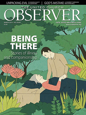

Before and after: The United Church Observer (left) became Broadview (right)

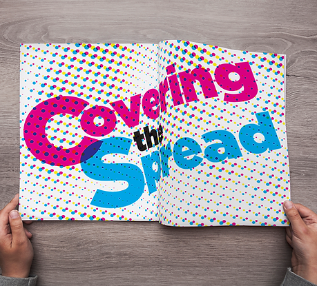
Feature spread from the redesigned Broadview magazine